pidgin (ˈpɪdʒɪn)
— n
a language made up of elements of two or more other languages and used for contacts, esp. trading contacts, between the speakers of other languages. Unlike creoles, pidgins do not constitute the mother tongue of any speech community.
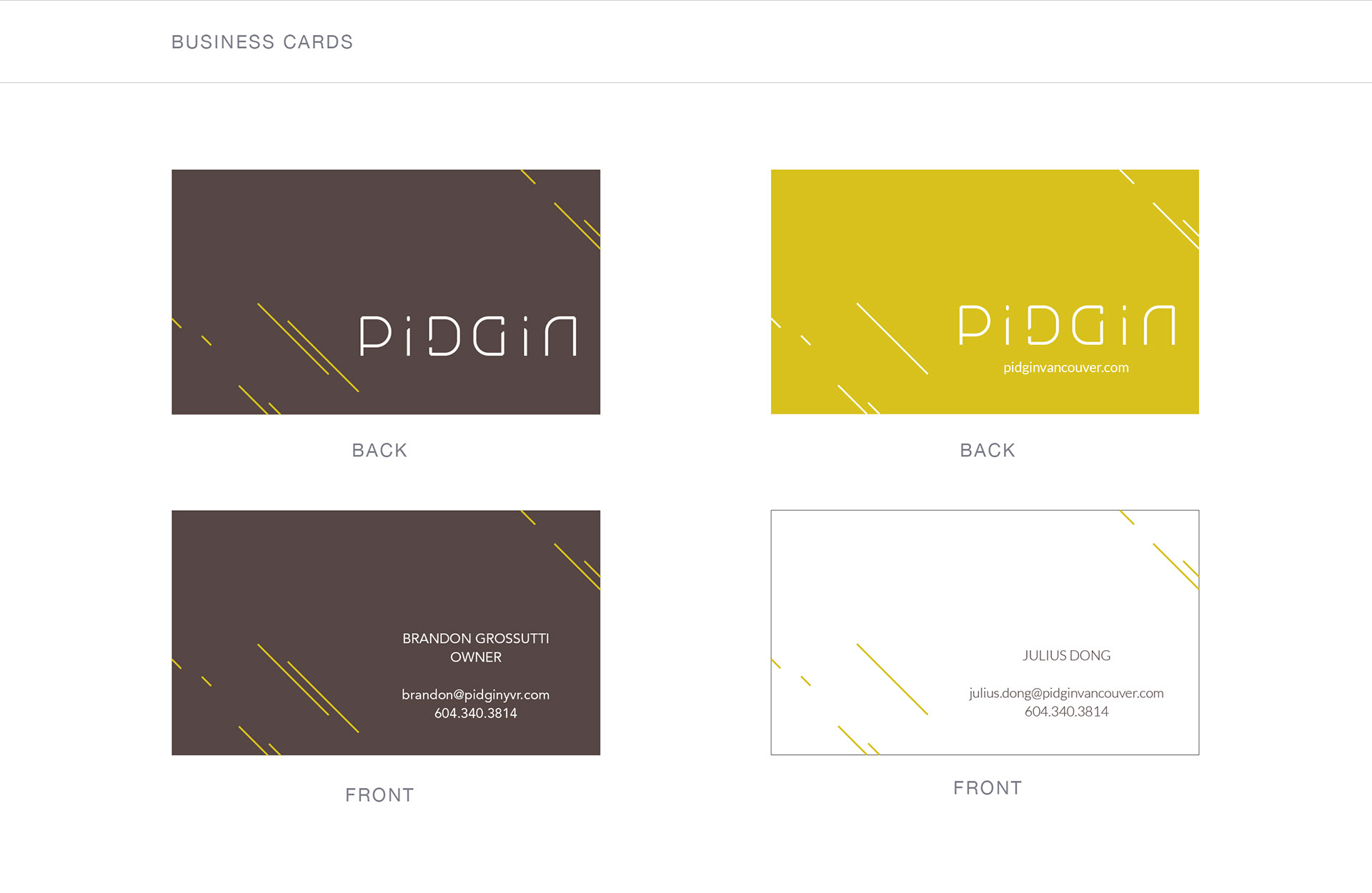
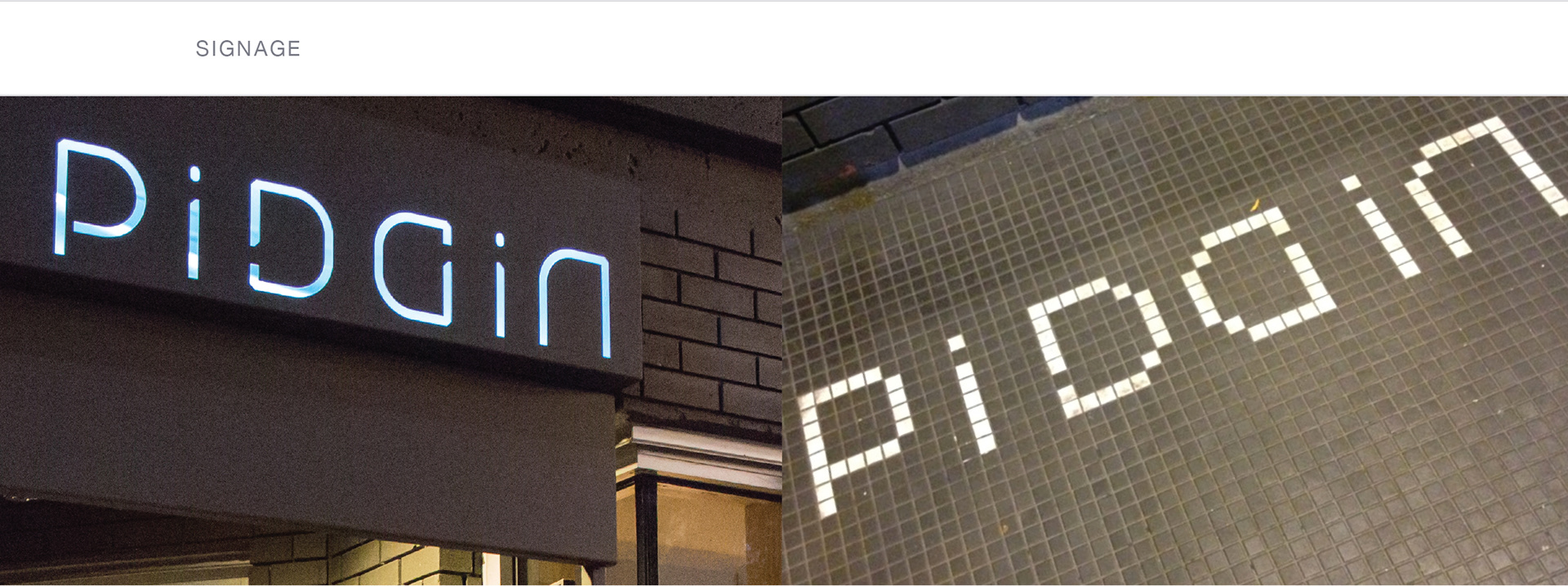
Project Title:
Pidgin Restaurant Identity
Project Objectives:
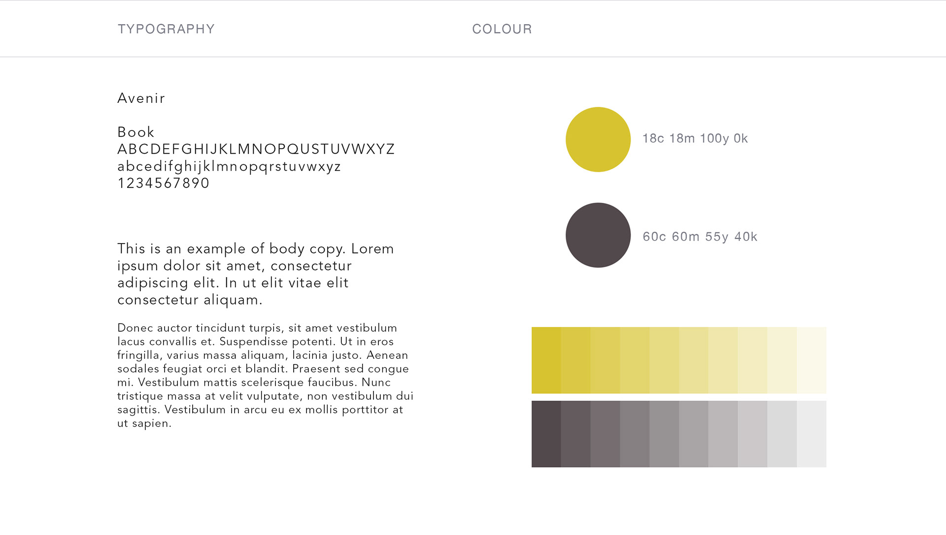
To design an identity for the new Pidgin restaurant, a Japanese/French fusion dining experience situated in Pigeon Square in downtown Vancouver. The identity needed to be clean and modern, and in some form, illustrate the meaning of Pidgin as language.
Key Audience:
Foodies and restaurant patrons who enjoy the range of restaurants in and around the Gastown area.
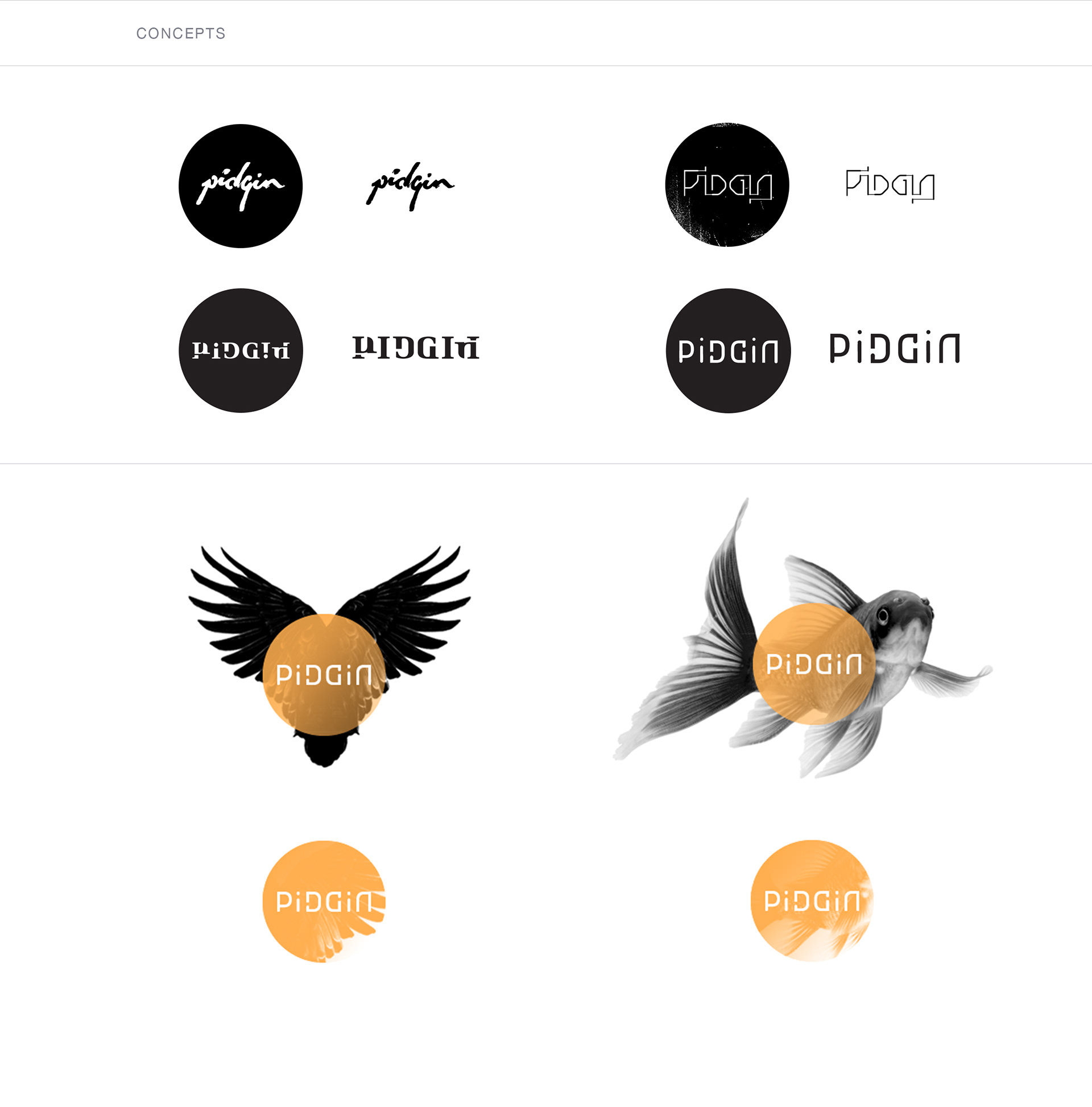
Design Solution(s):
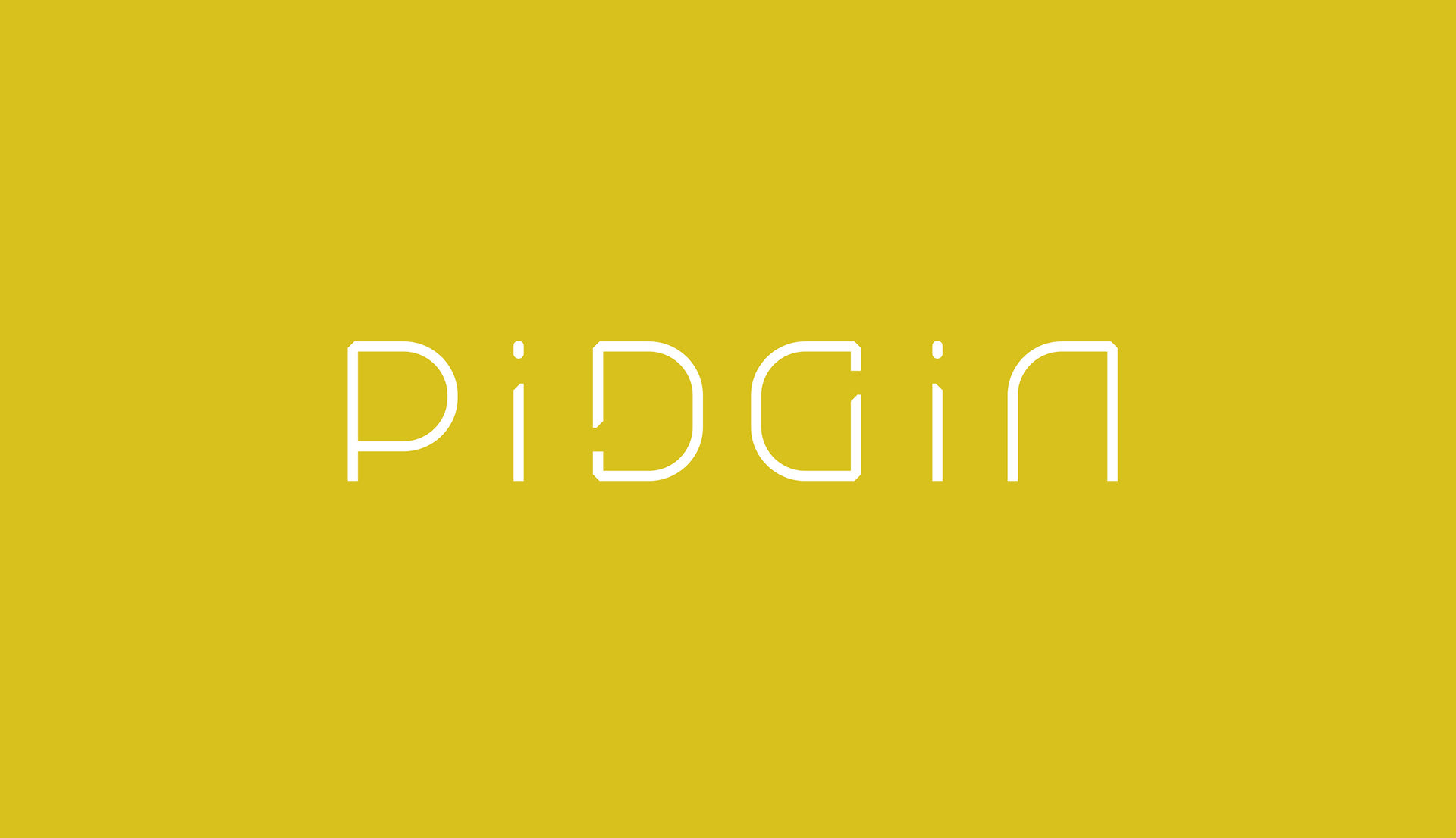
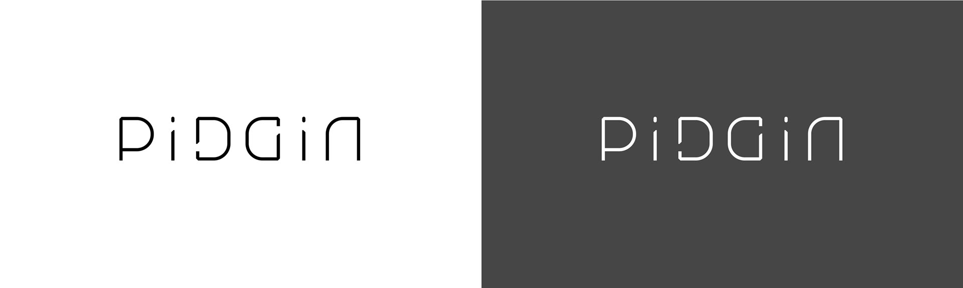
My strategy was to use a custom type treatment to represent Pidgin as a language. Wiki states: “pidgin language is a grammatically simplified means of communication that develops between two or more groups that do not have a language in common: typically, a mixture of simplified languages or a simplified primary language with other languages' elements included.”
With this in mind, I strived to create a simple, easy to read logotype that included unified elements between each glyph, some being an exact copy which was then either mirrored or flipped. I also wanted to include an ambigram-like detail, which worked perfectly where the D and G meet - the point where the “two sides come together”.
The solution was a mixed case logotype that had a nice rhythm and flow with personality and carried depth of meaning.
