" Gone is the old blue and red logo. In its place is a geometric image in purple and white - a design meant to cut across cultures and evoke an organization that is more youthful, dynamic and modern."
- Vancouver Sun, June 17th
Project Title:
NPA Vancouver logo
Project Objectives:
To create a logo for the re-branding of the NPA civic political party, as they looked to reinvent themselves as an official civic political party and voice of the opposition. To create a friendly, accessible and inclusive presence for citizens of Vancouver. Keywords included: global, dynamic, cultural, diverse, connected, renewed, and youthful.
Key Audience:
Civic voters, current and new NPA members, staff and the executive committee.
Design Solution(s):
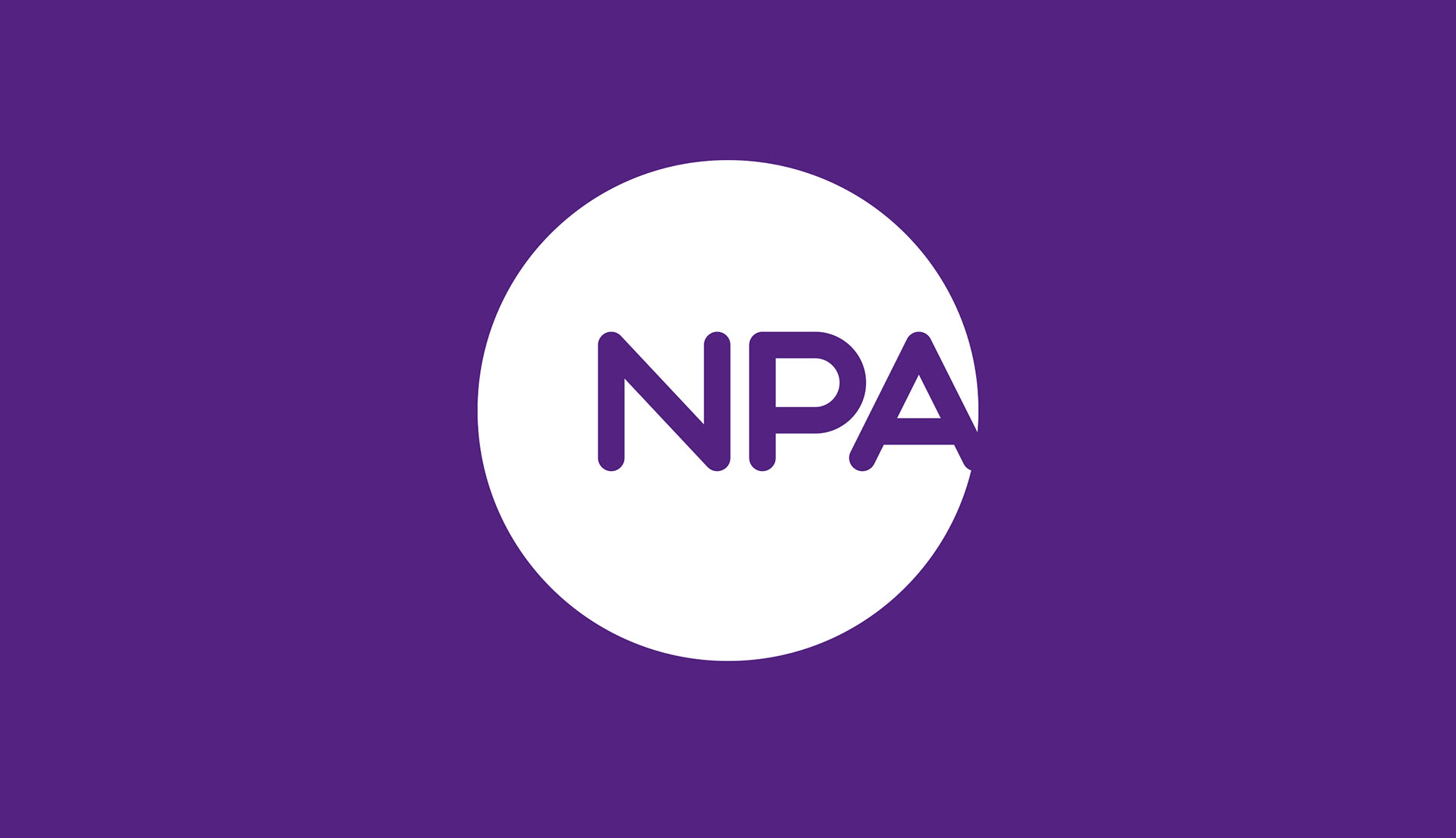
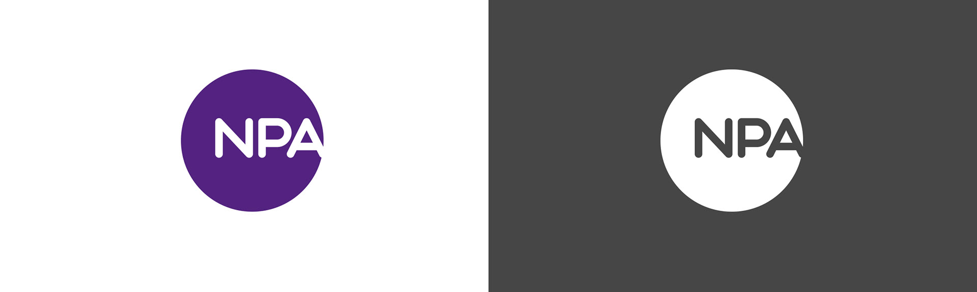
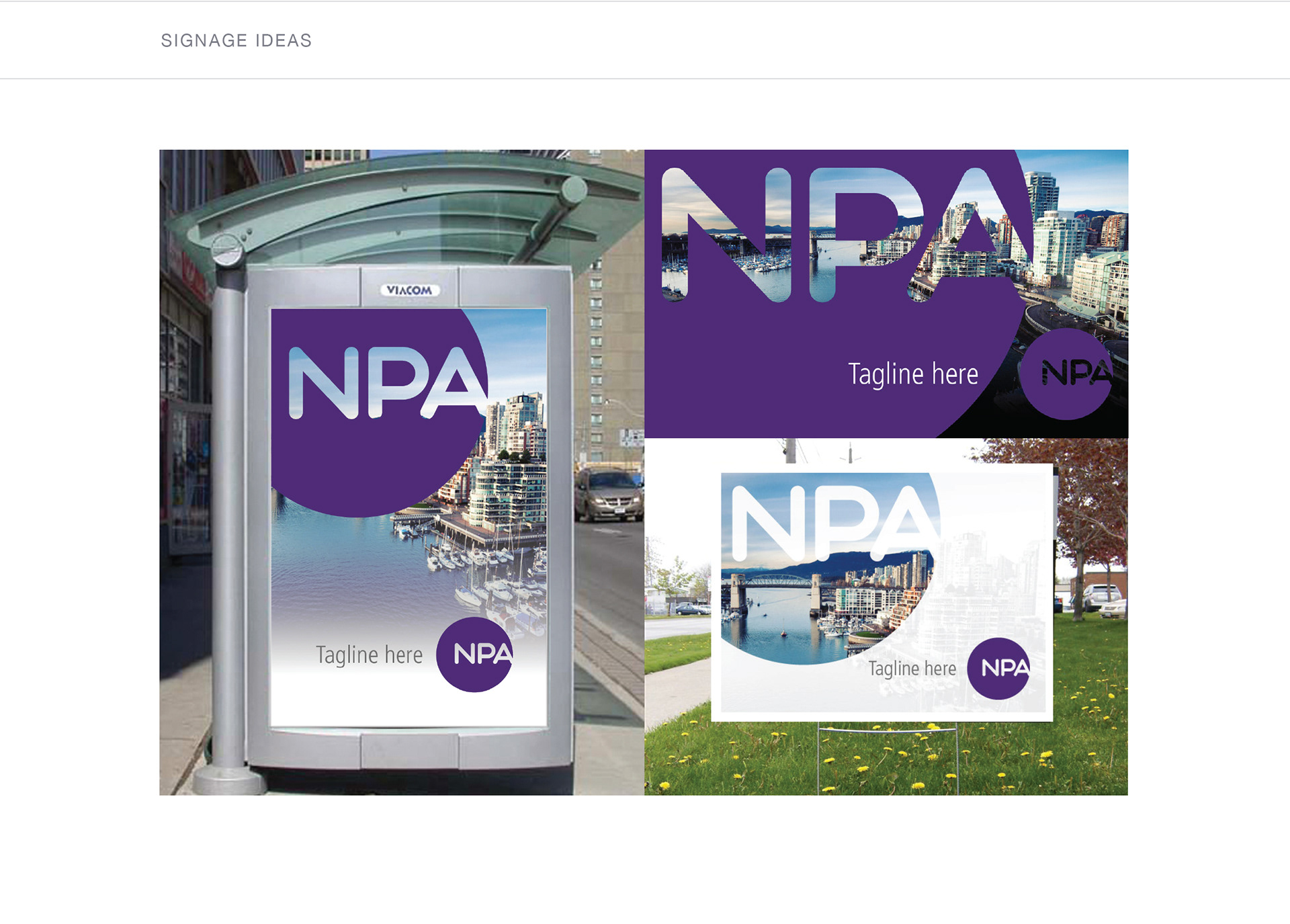
The strategy was to break from the traditional party colours and logo with the creation of a fresh new look that is simple, readily identifiable, and accessible, while being flexible enough to be applied to almost any medium. Given the long history of the NPA, this update was needed to signify a change and to appeal to a more culturally diverse and younger audience.
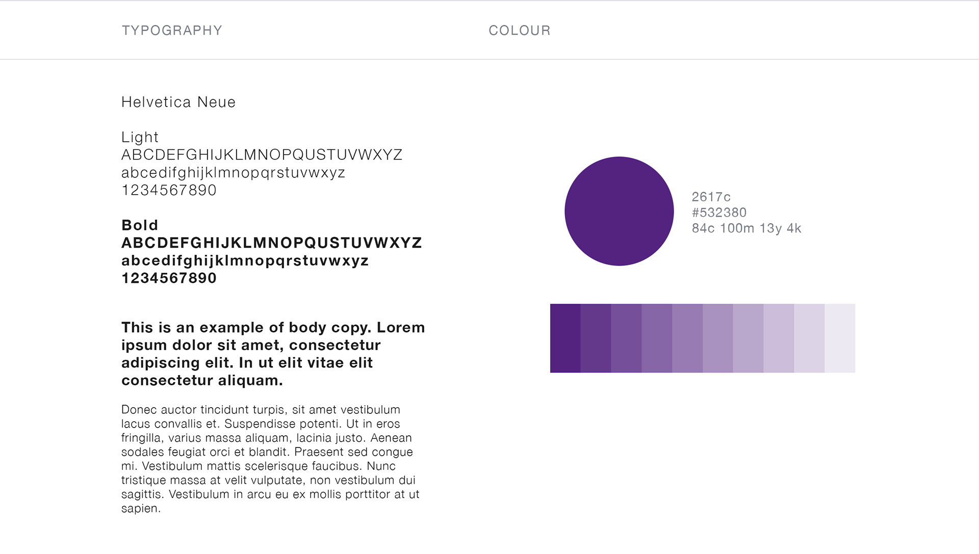
Their traditional party colours had been blue and red so we selected to combine these and use purple to signify party unity. Purple also carried further meaning such as: courage, dignity, self respect, high-tech, magic, mystery, spirituality, the sub-conscious and creativity.
To further reinforce this notion of unity, the circle was a perfect shape and carried a variety of other meanings that transcend cultural differences. Circles commonly represent unity, wholeness, and infinity. Without beginning or end, without sides or corners, the circle is also associated with the number one. In Chinese culture, the circle stands for “fulfilled”, “oneness”, “perfection”, and “unity”. Enso is a Japanese word meaning "circle" and a concept strongly associated with Zen.
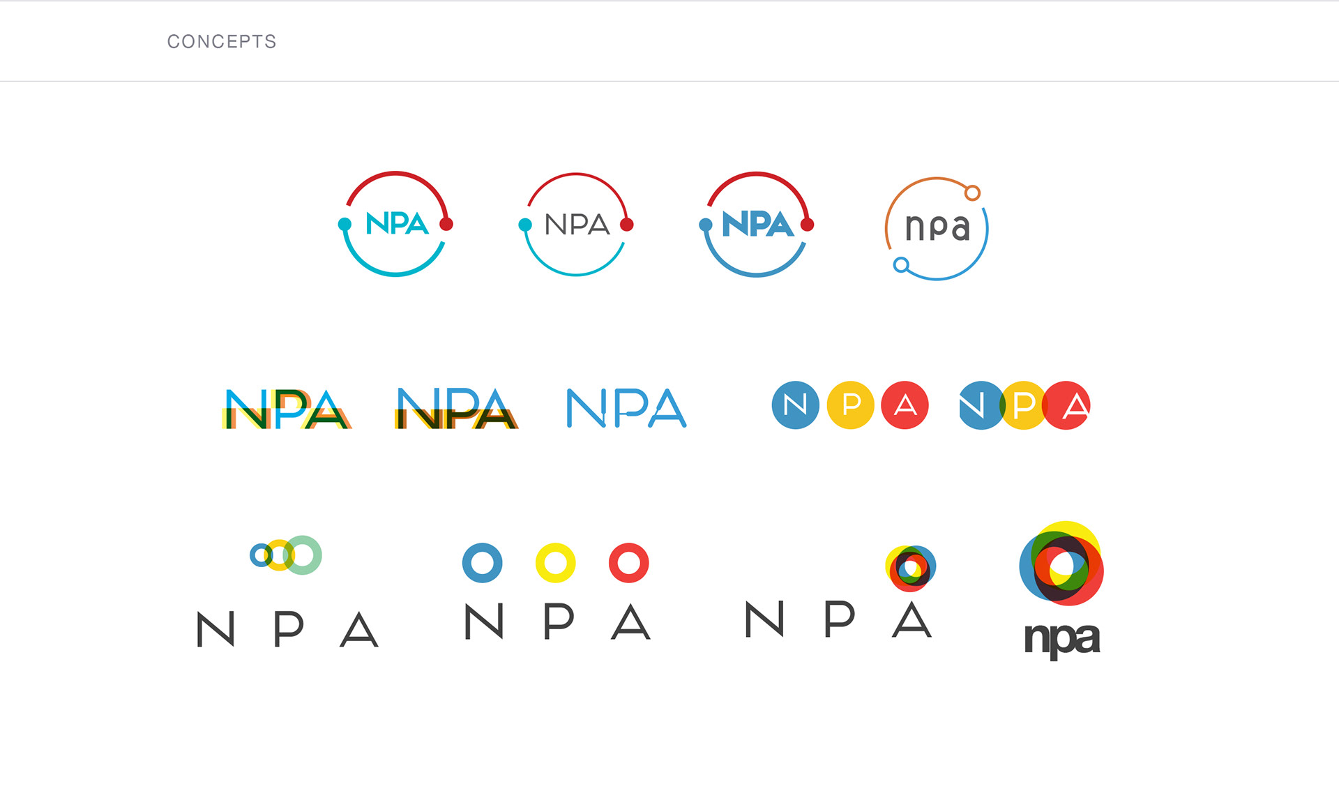
For the letters “NPA”, a custom type treatment was created and positioned as a breakout element to suggest moving from the past and forward thinking. The final mark was one that is clean and simple, yet contains depth of meaning across Vancouver’s culturally diverse population.
