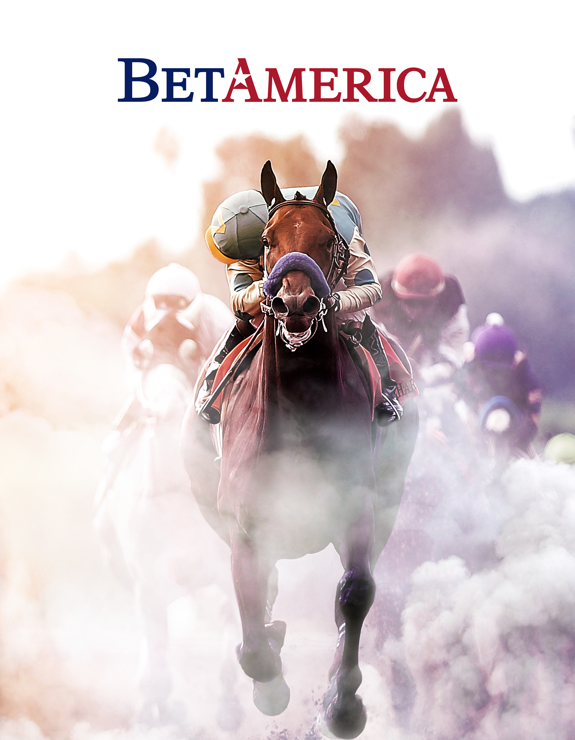
Clean, Concise and Confident. The design of a highly tailored logotype for an industry steeped in history and a company responsible for ushering it into the digital age.
Project Title: BetAmerica Logo and Brand
Project Objectives: To create an identity for an online company focused on legalized horse racing and handicapping contests. Being a US company providing a wide range handicapping services and products to US citizens their objective was to present an identity reflective of their professionalism, legally operated service provider, security and safety.
Key Audience: Online and land-based horse racing and gaming customers. Customers who were looking for an alternative to the big 3 operator in the industry.
Design Solution(s): The solution was to create a simple, yet elegant and unique, logotype to represent a company whose industry, the sport of kings, is steeped in history.
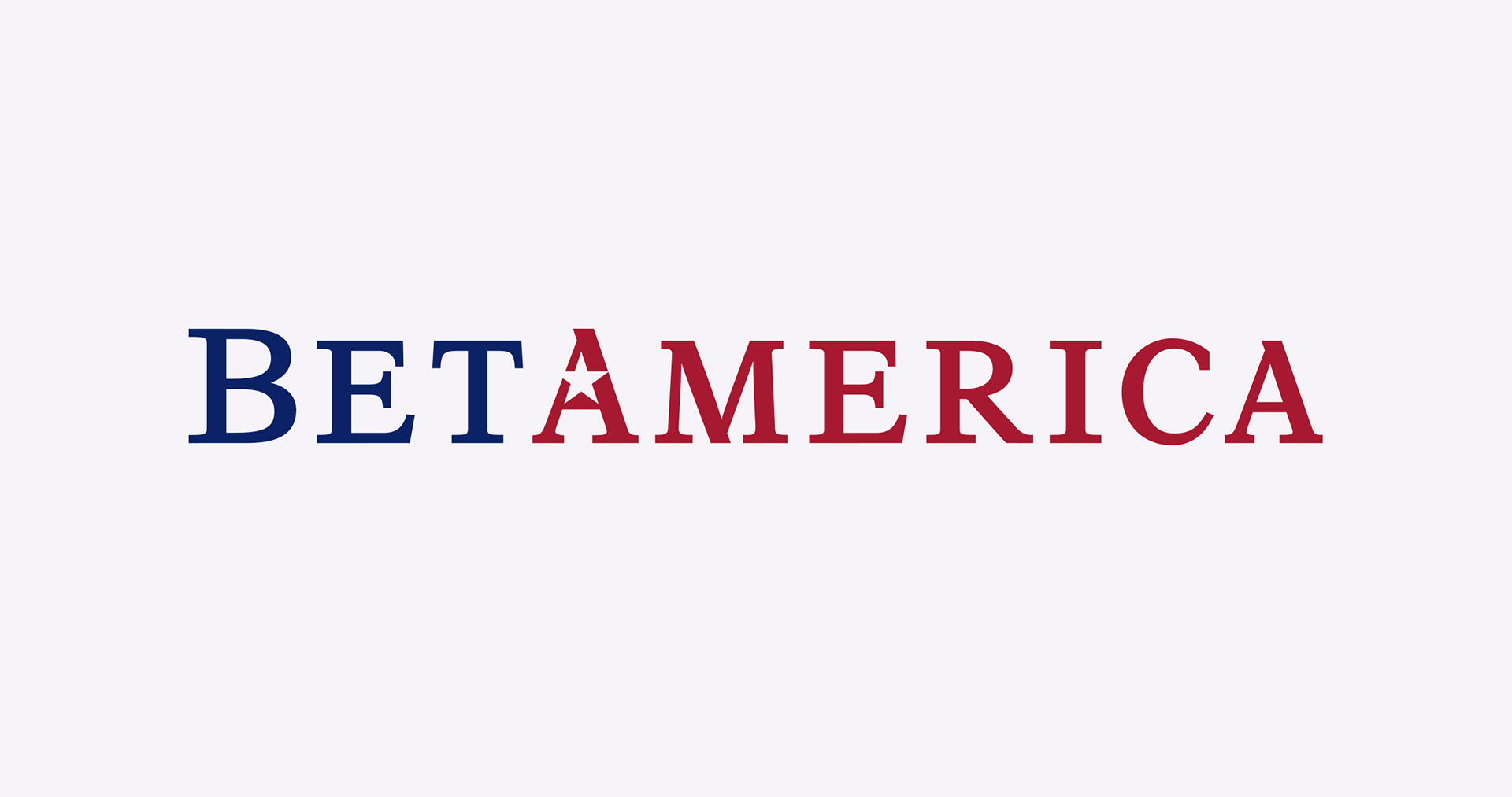
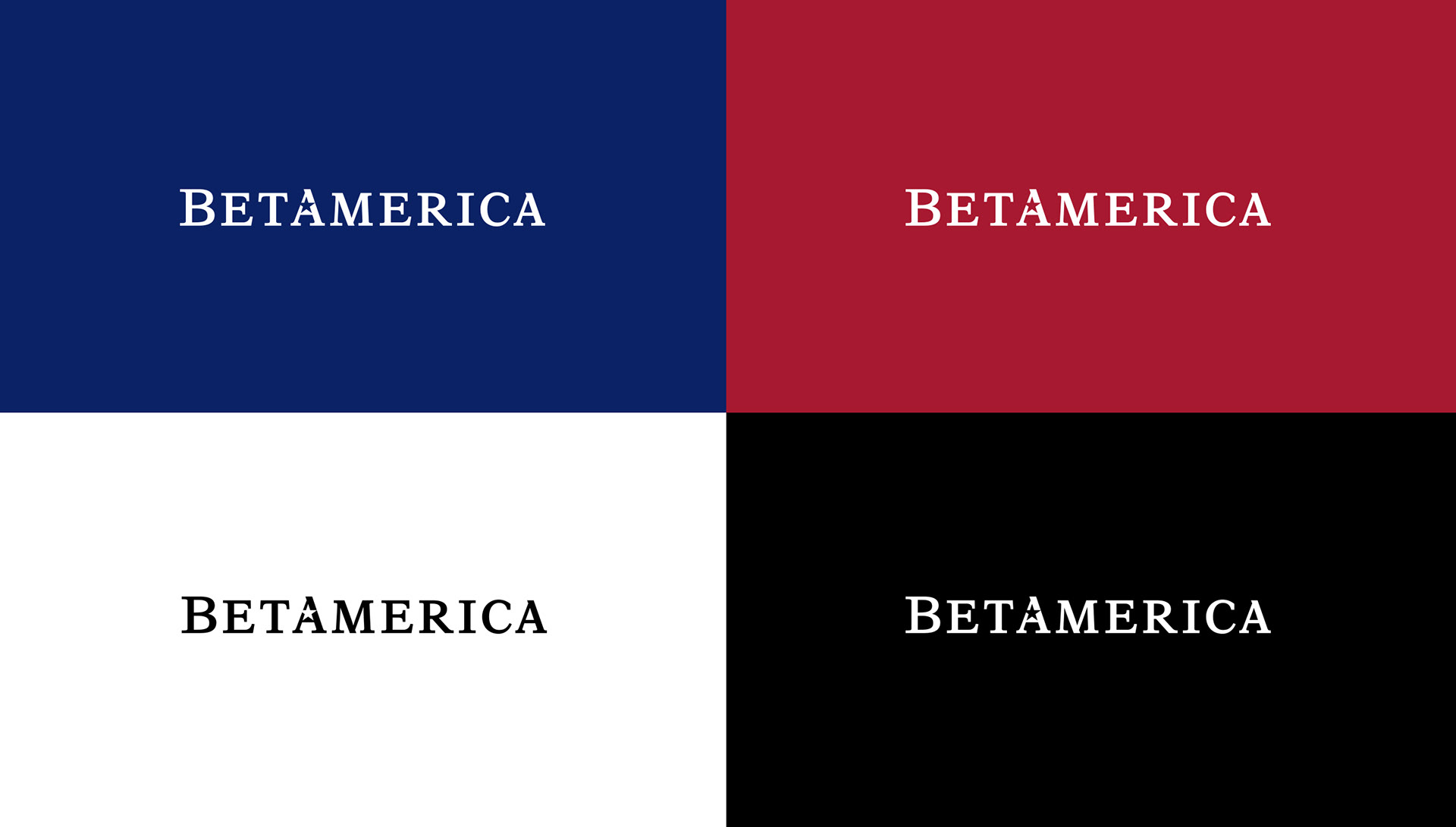
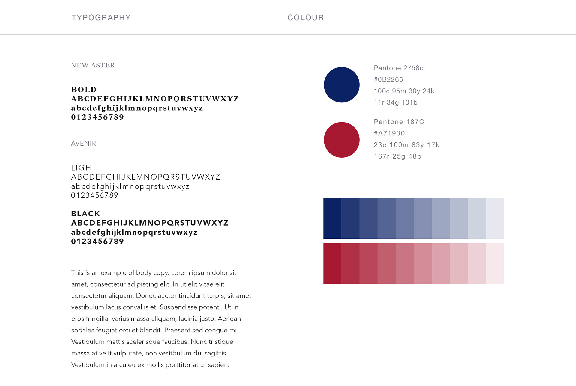
Selecting a serif font, New Aster, was the basis for the letter-forms which worked well to create a classic, trusted and nostalgic look while still appearing modern. I tweaked and modified the letter-forms and spacing to further simplify the overall look to create a cohesive logotype.
Nesting a star element in America provided a needed graphic element for branding and greater connection to the US audience, as America is the biggest segment of the company's market. In the two colour version, the blue and red I selected were directly based on the American flag and also served to delineate the company’s conjoined two word name.
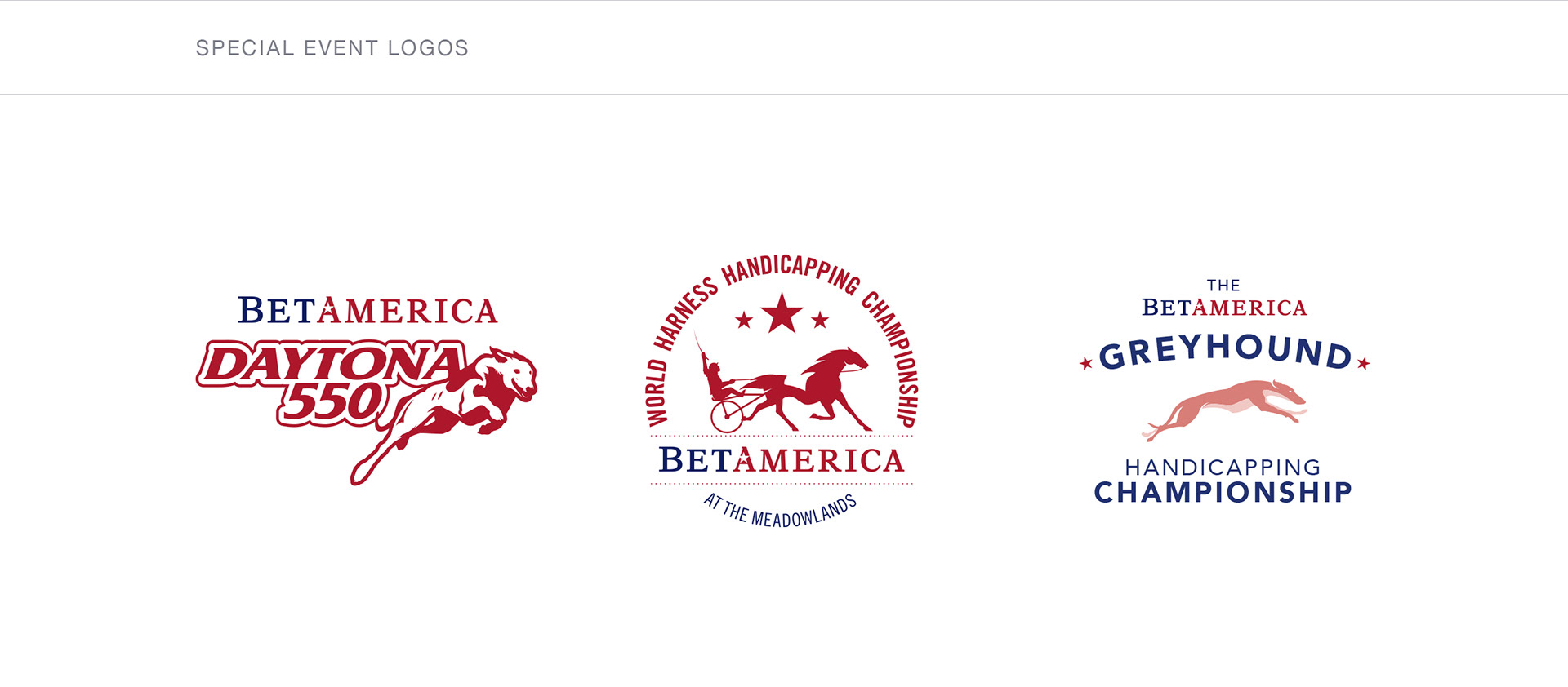
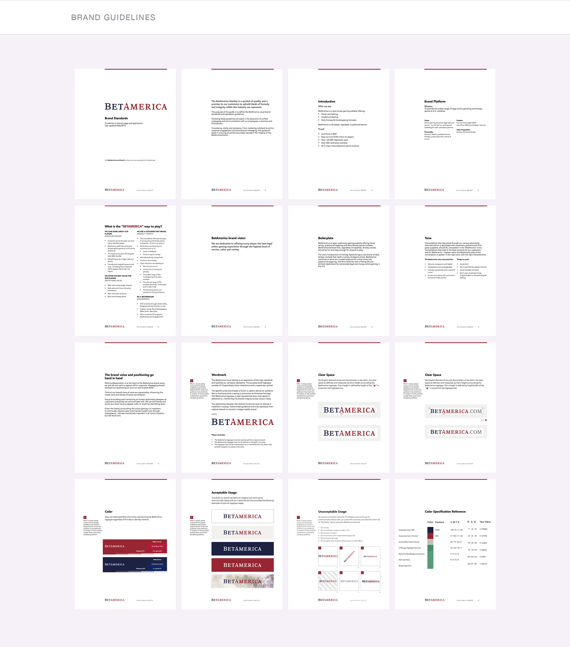
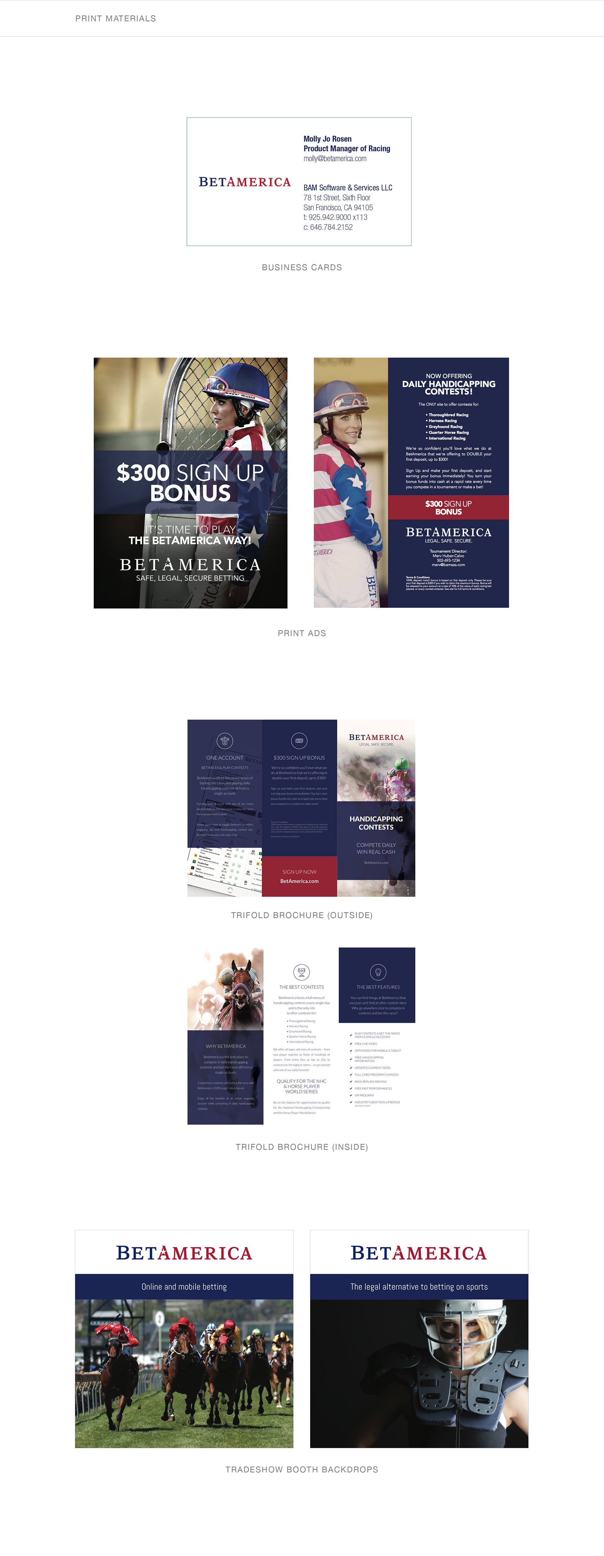
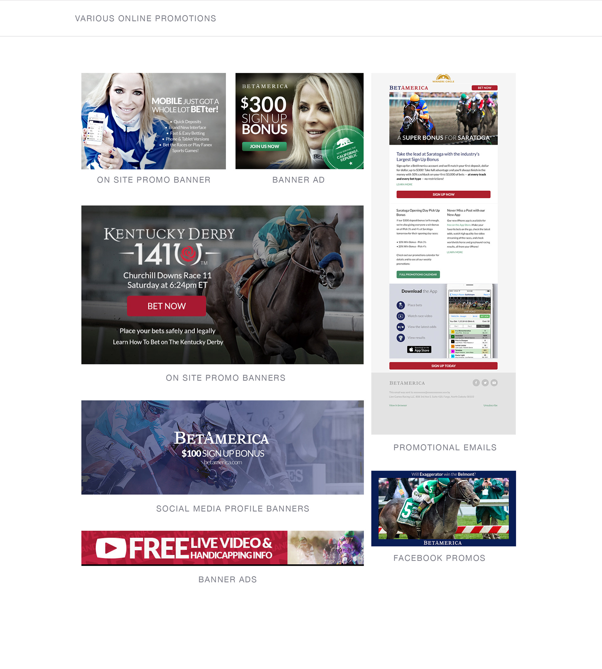
The final solution was a logotype with brand-able elements that provided solid basis in which to create a wide range of promotional materials and branded content for years to come.
