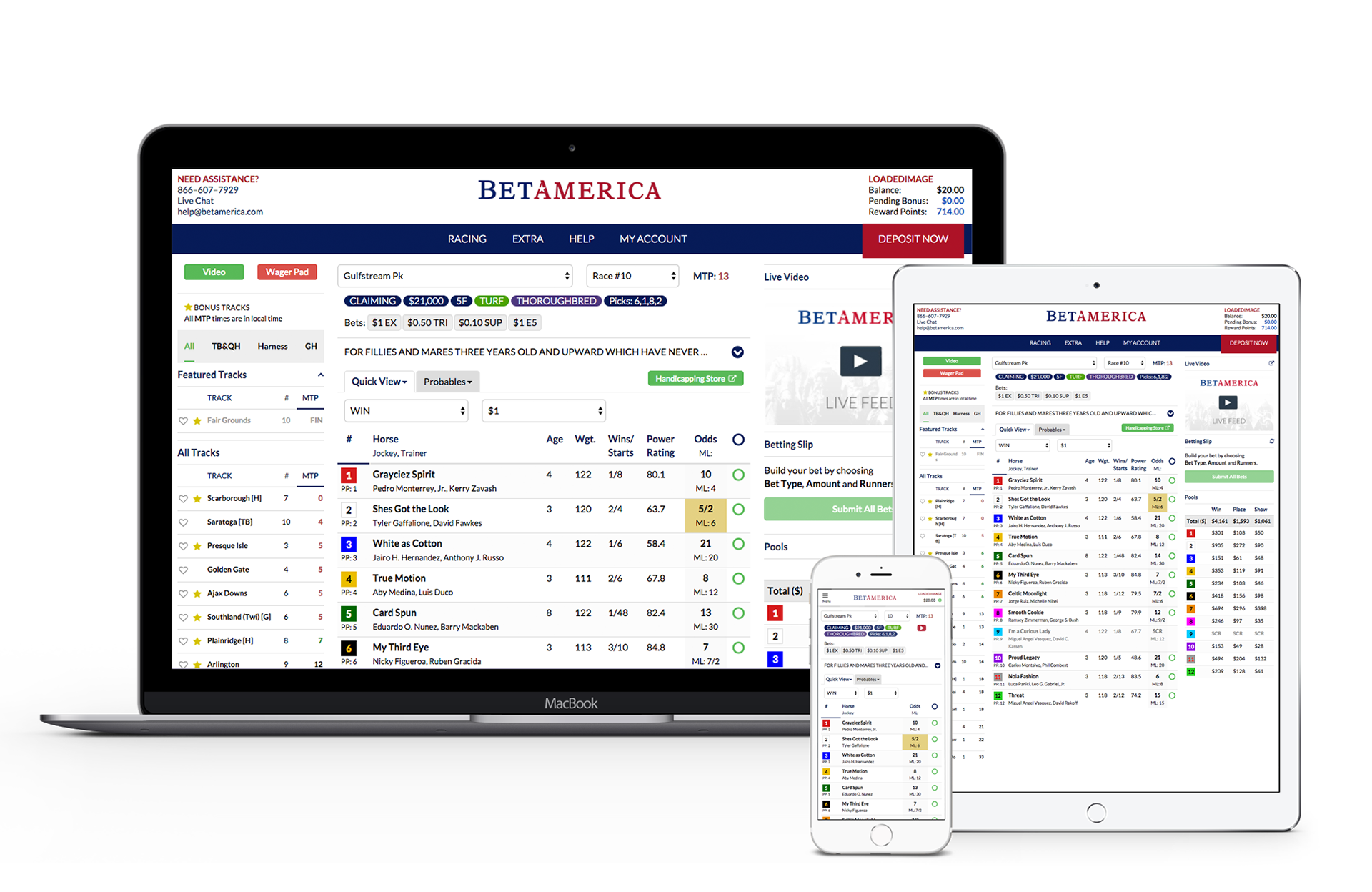
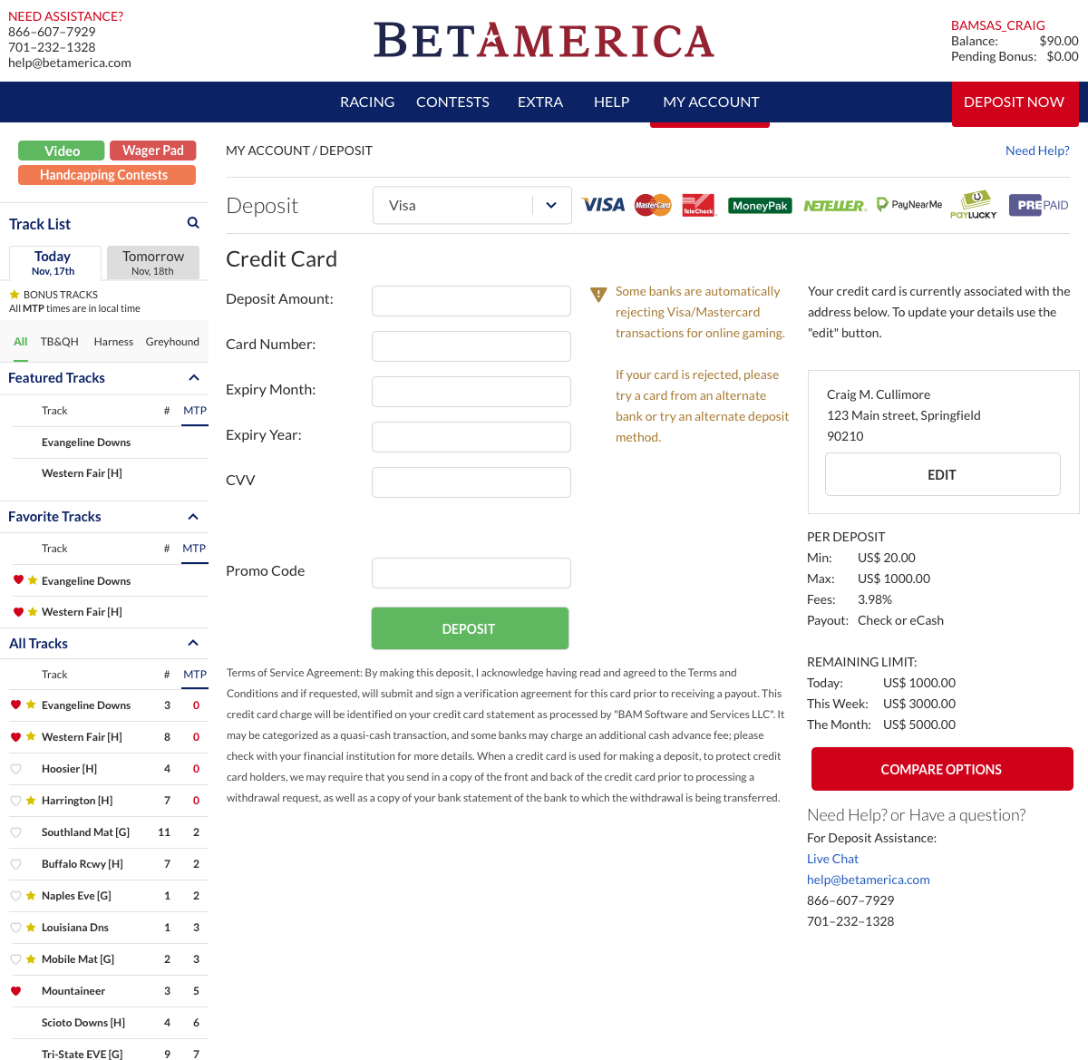
Large amounts of data needed to be organized effectively and efficiently through the use of nested elements, pulldowns and colour and textural hierarchies. The solution was to create a clean and easy environment for new users to orient themselves while being robust enough to appeal to the more advanced users.
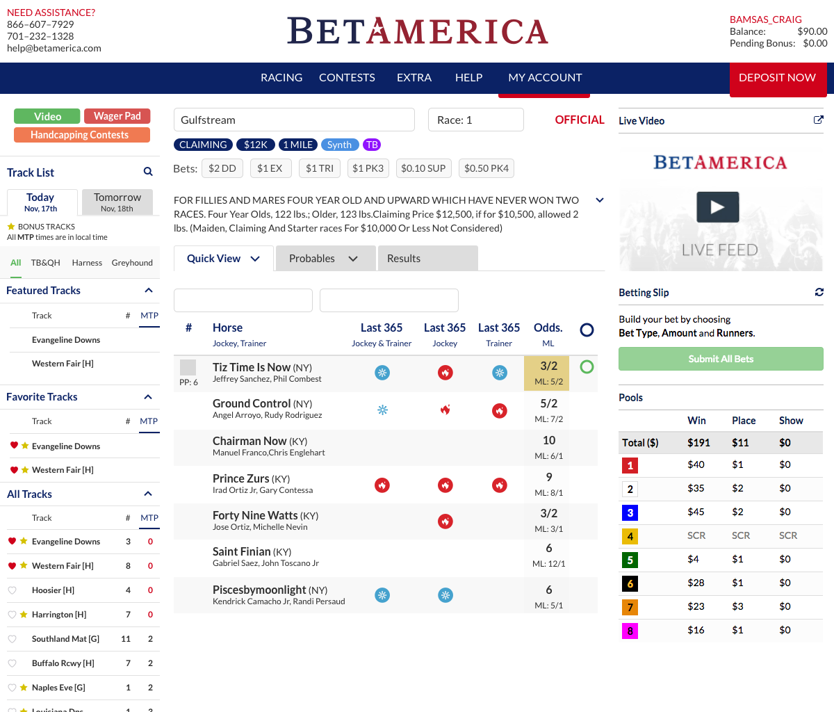
Handicapping UI
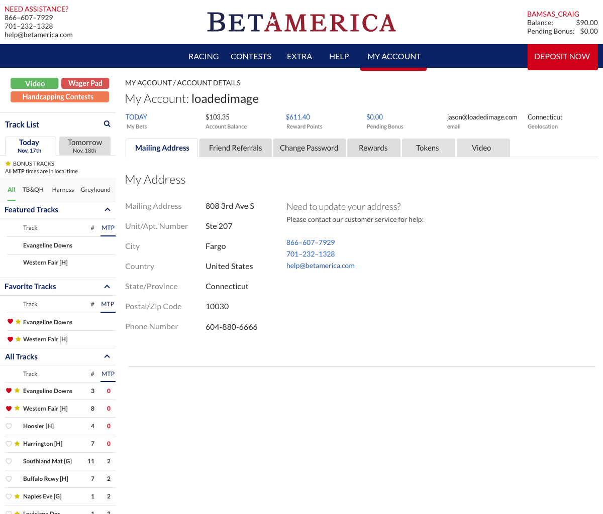
Account Details UI
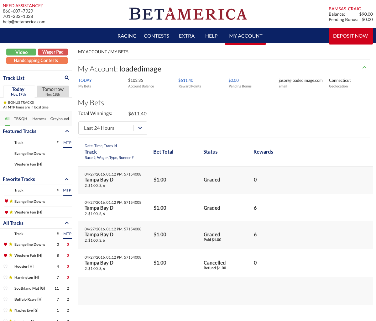
Bet History UI
Deposit and Withdraw UI
Project Title:
Software Client UI/UX
Project Objectives:
To plan, design and create a user-centered and completely responsive UI for the BetAmerica software client.
Key Audience:
Customers, experienced and casual, who require access to large amounts of data and statistics in order to make informed decisions on their selections.
Design Solution(s):
Due to the large amount of data needed for each screen, I needed to strip everything down to its essentials. All design, colour and layout had to be purposeful to ensure no confusion between the data on the screen and essential visual elements such as horse silks. There had to be a balancing act between the volume of statistics shown and white space used.
I opted for a well organized system with built in hierarchies, simple colours and shapes, and ensured all design elements were placed for maximum usability and functionality. My ultimate goal was to take a potentially complicated experience and create a visually simple, light and enjoyable user experience.
